

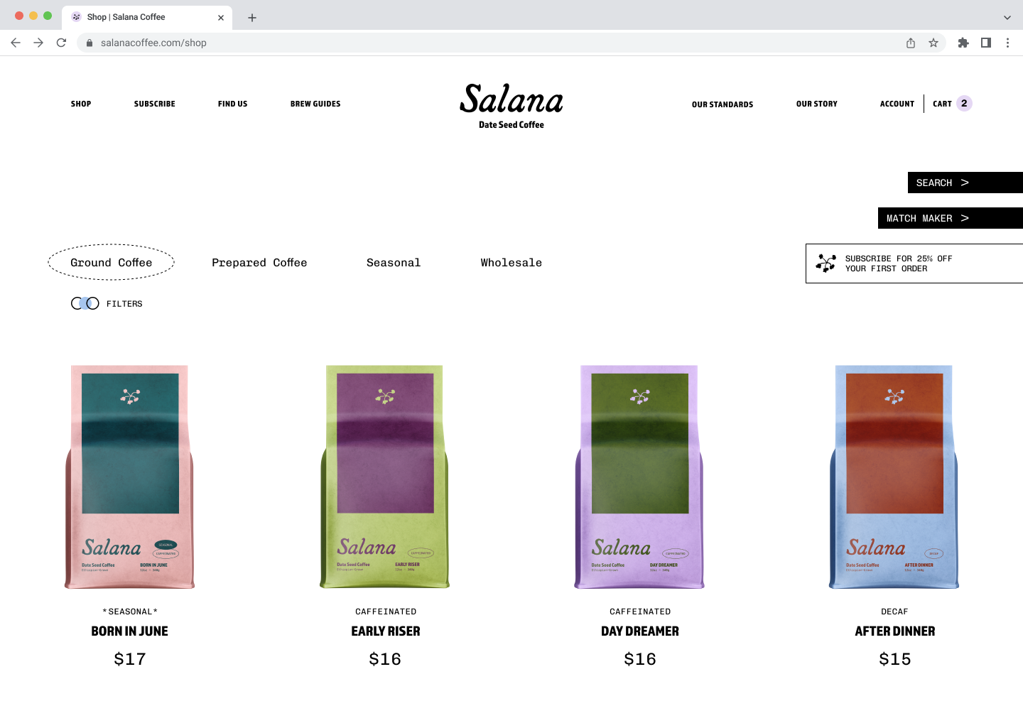
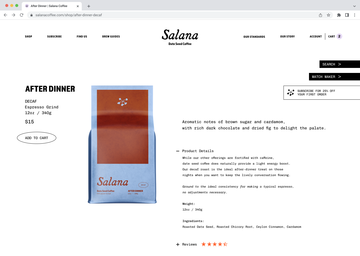
Salana
FMCG PACKAGING | DIGITAL
Salana (Ethiopian name meaning sunshine) is a coffee alternative made from roasted date seeds, founded by two Ethiopian sisters concerned with their home’s economic and ecological future. This is their attempt to lessen the burden of coffee production.
The branding for Salana is inviting, modern, and familiar in a way that does not alienate itself from traditional coffee brands. With an enticing look, the brand aims to seamlessly become a part of the everyday routine.

The Earth was top of mind in creating Salana, and this design aims to be a visual representation of that. Taking inspiration from the quiet beauty of nature is a gentle color palette that remains eye-catching.
The elementary colorways (two colors max) and solid blocks of color are uncomplicated. Creating a visual simplicity signals to the consumer an ease in transitioning away from traditional coffee.
Student concept project