
Resonate
TYPESETTING | DIGITAL
A quarterly print publication that celebrates the rich history of music,
and highlights unique creative processes and emerging artists.
With a solid writing team locked in, Resonate allowed itself to shift focus onto the magazine’s aesthetic qualities, understanding that reading can be more than an intellectually stimulating experience - it can be a visual delight as well.


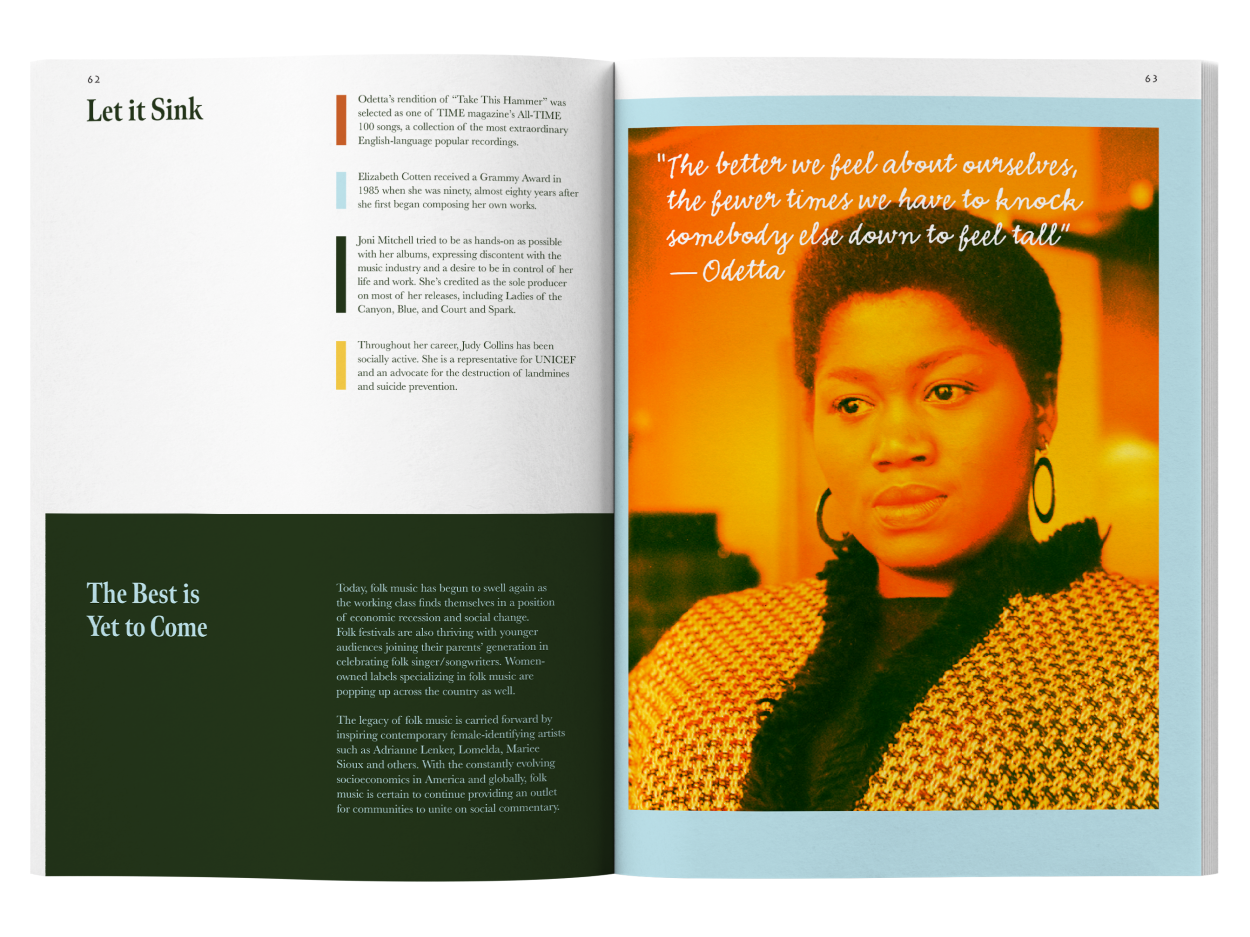
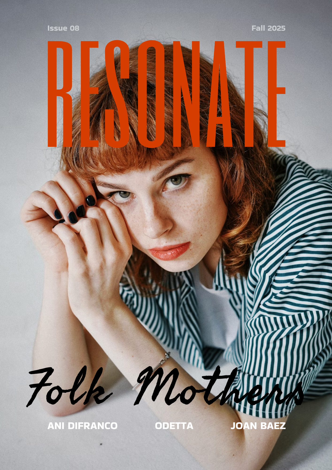
The featured article, Folk Mothers, utilizes a handwritten typeface, overlapping elements, and patchwork images reminiscent of a scrapbook. The use of storytelling throughout music, as well as within the magazine itself, is the primary inspiration for these design choices.


Thoughtful design transcends print and Resonate is translated for the digital world. Rather than to simply copy & paste an article’s content, the website is designed to be a cohesive extension of its printed self. A focus on clean lines, warm coloring, and intriguing photography is apparent throughout.
Resonate’s visual identity is a balanced mix of familiar comforts and fresh modernity, not unlike its musical interests.

Student concept project